Transforming static files into interactive e-books.
Issuu is a digital publishing platform. People upload a PDF, and Issuu turns it into a flipbook, articles and social posts they can share, embed and sell. Its creators range from independent magazines to brands, schools and nonprofits. It runs on a freemium model: free to start, with paid plans that unlock more documents and features.
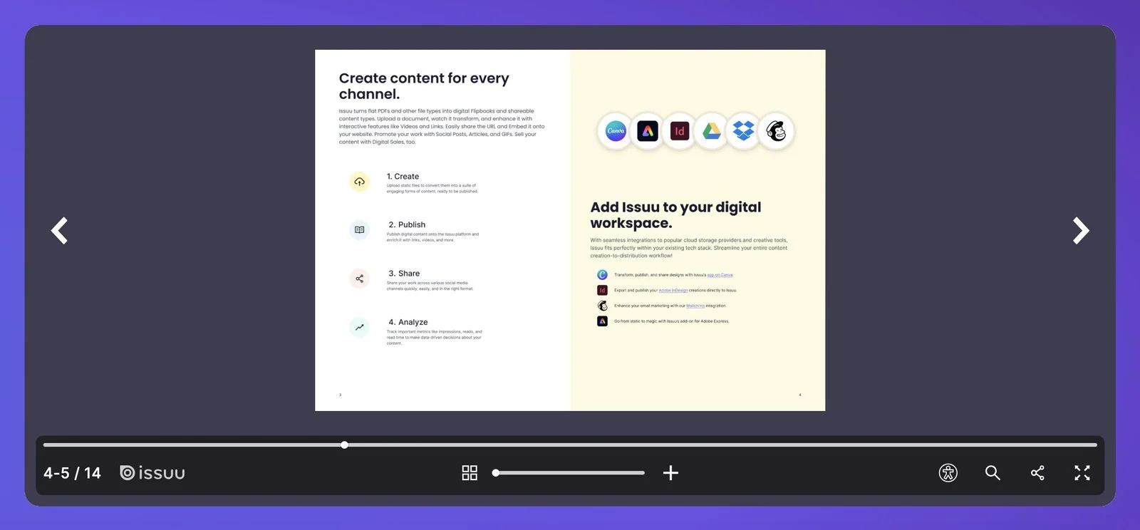
A PDF turned into an Issuu flipbook. Image: Issuu.
Users weren’t activating because onboarding steps were unclear.
Too few new users activated. They had to create an account before seeing their file as a flipbook, then landed in a workspace with 17 menu actions competing for attention.
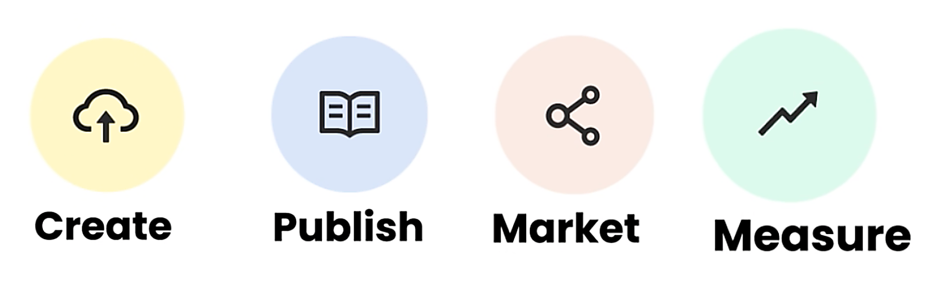
Activation steps.
The path to activation: create, publish, market, measure. An activated user has published and shared.
Two key UX improvements showed new users the value of Issuu sooner.
One-click preview of all offerings, before creating an accountUpload without an account and see your file as a flipbook, with every other format one click away.
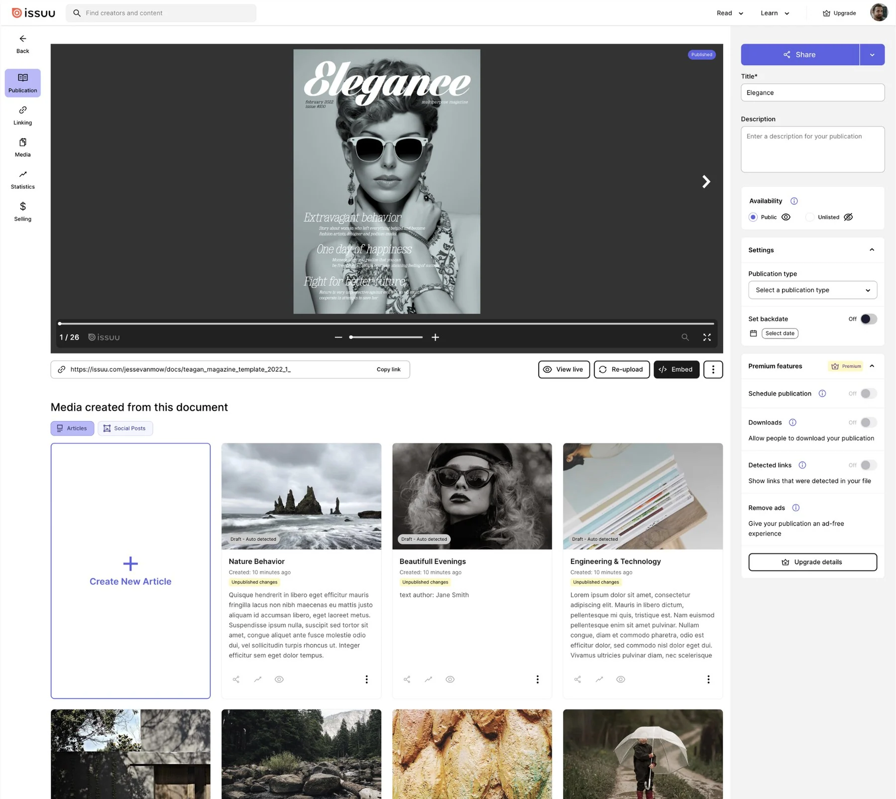
A simplified workspace with clear onboarding steps and a cleaner information architectureOnce signed up, 6 menu actions instead of 17, sharing in one place, and clear steps to publish.
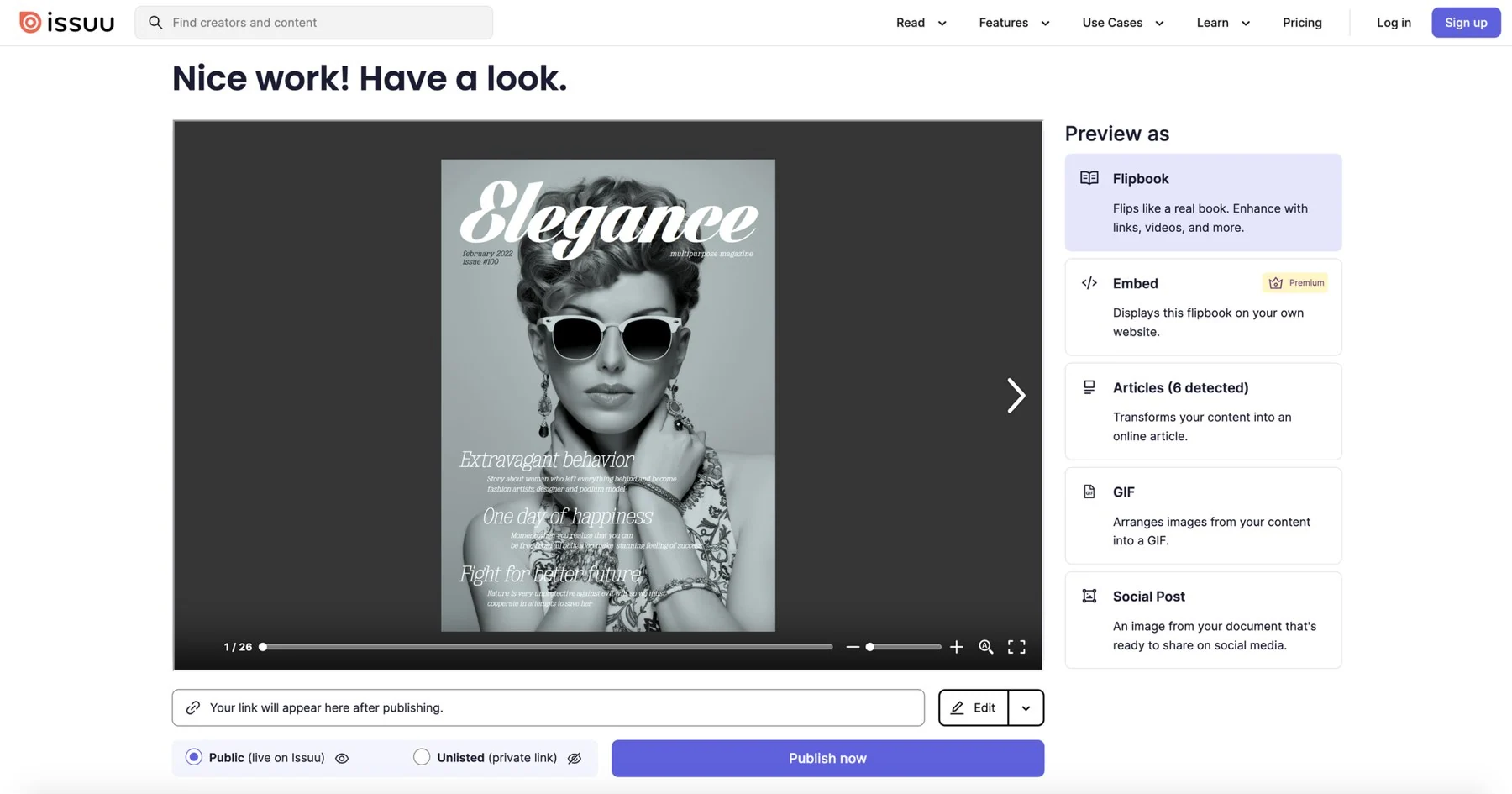
One-click preview of all offerings, before creating an account.
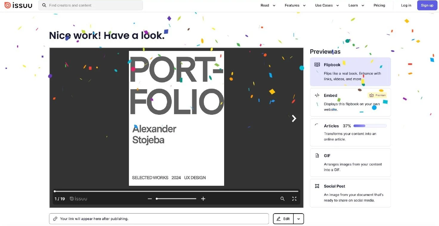
Upload and preview without an account, from 21 clicks to a one-click upload. People see their file as a flipbook first, and only create an account when they want to edit, publish or share. Loading states showed which formats a document would turn into, inspired by Berlin’s BVG.
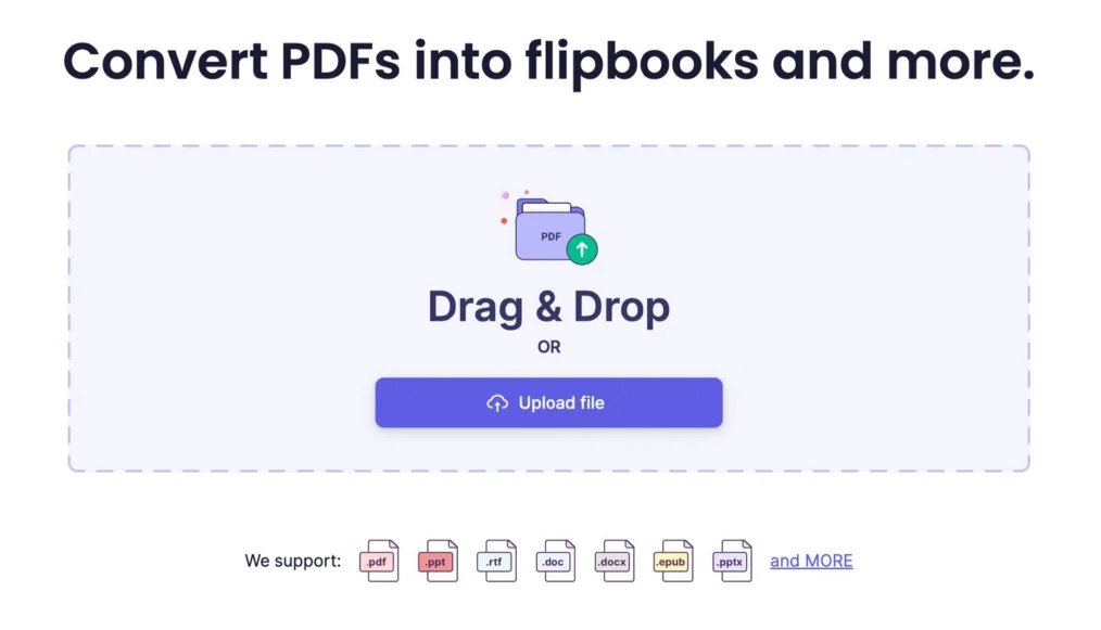
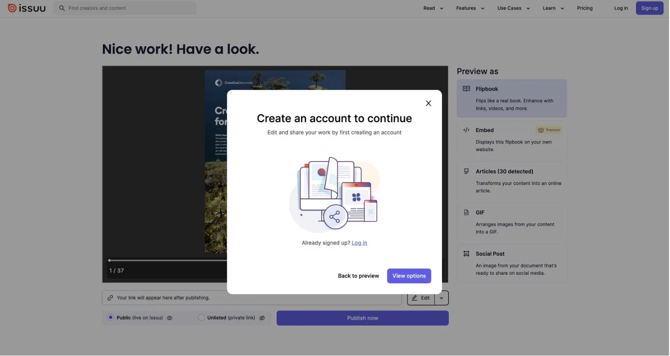
1. Upload straight from the homepage, no account needed.2. Nice work, have a look: the preview right after upload.3. From 21 clicks to one: every other format one click away.4. Editing, publishing or sharing asks for an account, once the value is clear.
A simplified workspace with clear onboarding steps and a cleaner information architecture.
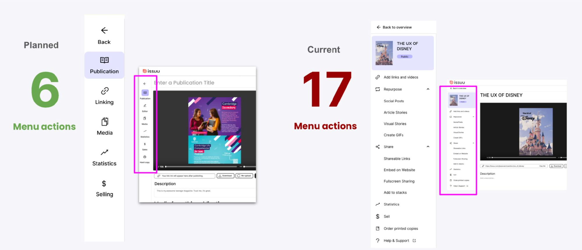
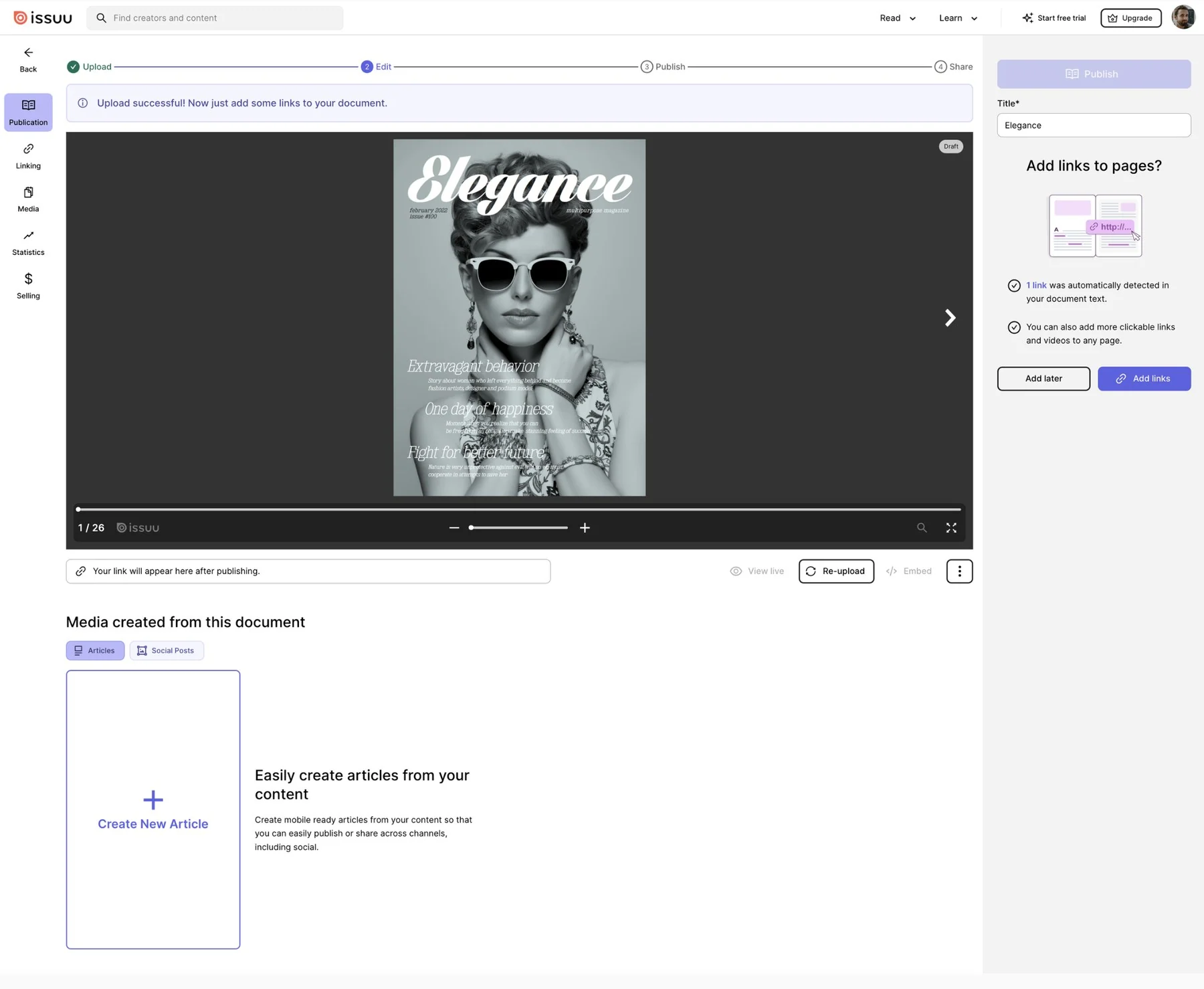
Once signed up, people landed in a workspace with 6 menu actions instead of 17, sharing consolidated into one place, and clear steps to publish. Hints were added, and settings moved from the bottom to the right of the page.
The old left-hand menu (right, 2021) had 17 actions. The new one (left, 2023) has 6, with sharing consolidated into one place.
Clear steps from upload to share.
After upload, a step bar shows where you are: upload, edit, publish, share. The first prompt invites people to add links, and says how many were already detected in their document.
New users see what Issuu does with their file before signing up, and activation rose 27%.
+27%Activation from preview before sign-up
~2×More likely to upgrade after seeing the preview
21→1Clicks to upload a file
17→6Workspace menu actions
Preview before sign-up drove a 27% increase in activation. In A/B testing, people who saw the preview were nearly twice as likely to upgrade to a paid plan.
The core workspace in 2024.
Activation grew by double digits year on year. Use of a key editing feature and a key content type grew by triple digits, and a key sharing feature grew fivefold.
Uploads fell as the company aimed for higher-quality traffic, yet the total number of activated users still rose.